Project Deliverables
PUMA's AW25 showroom
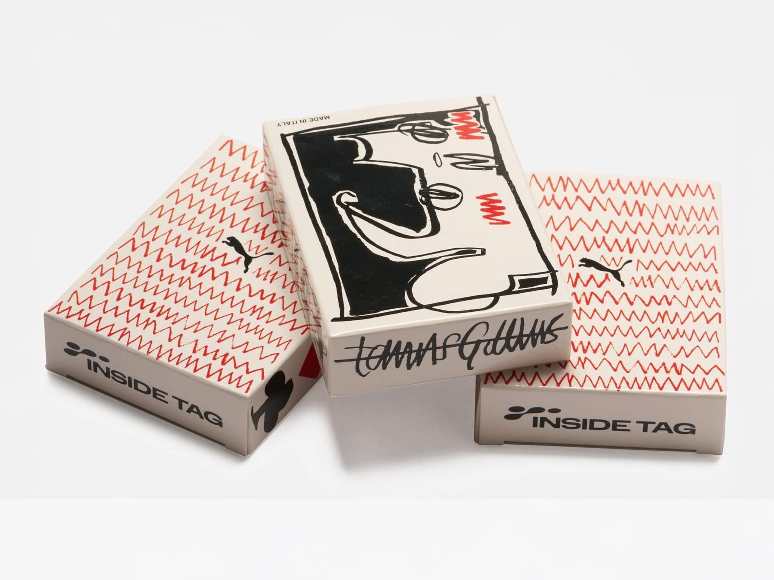
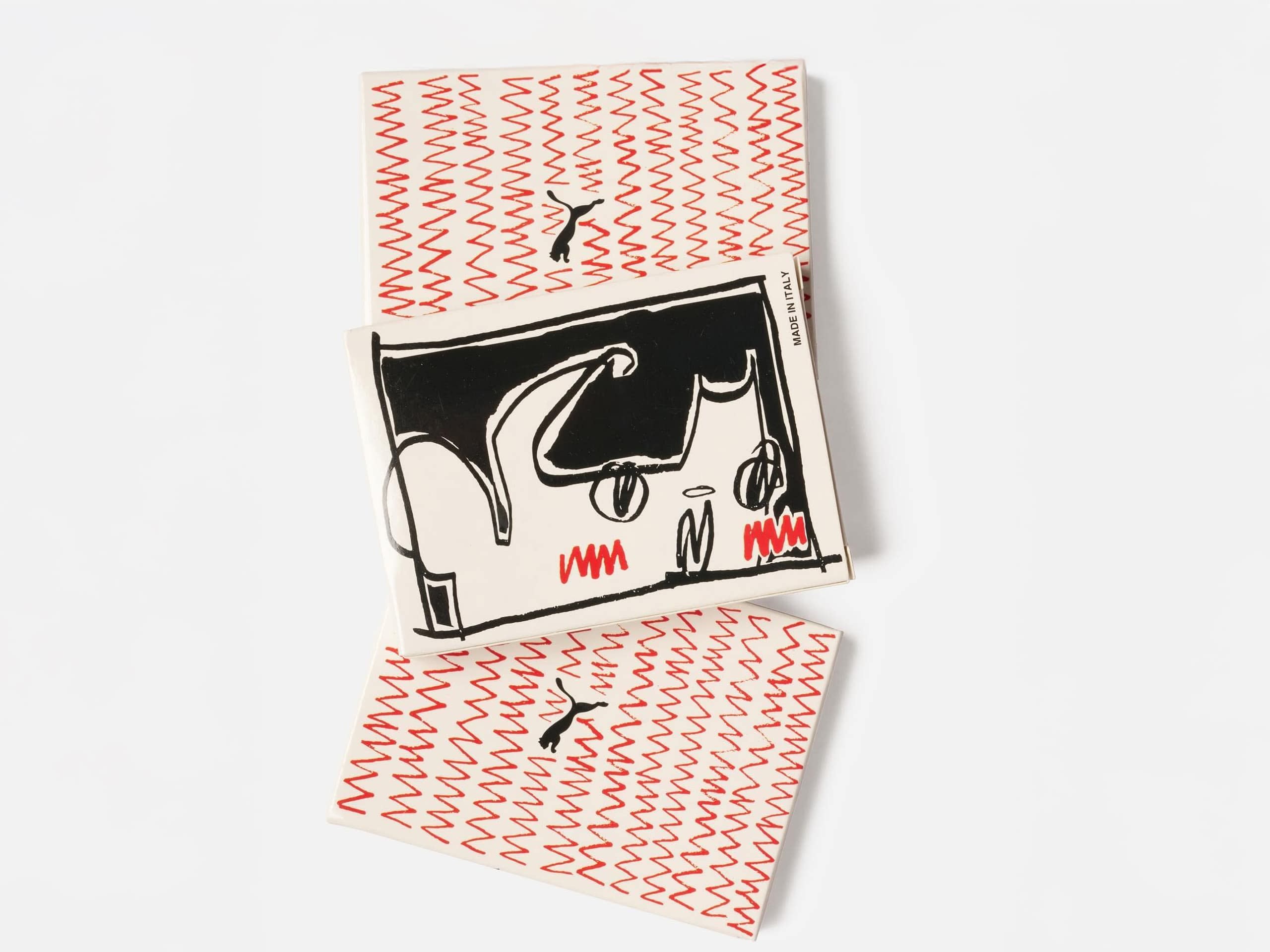
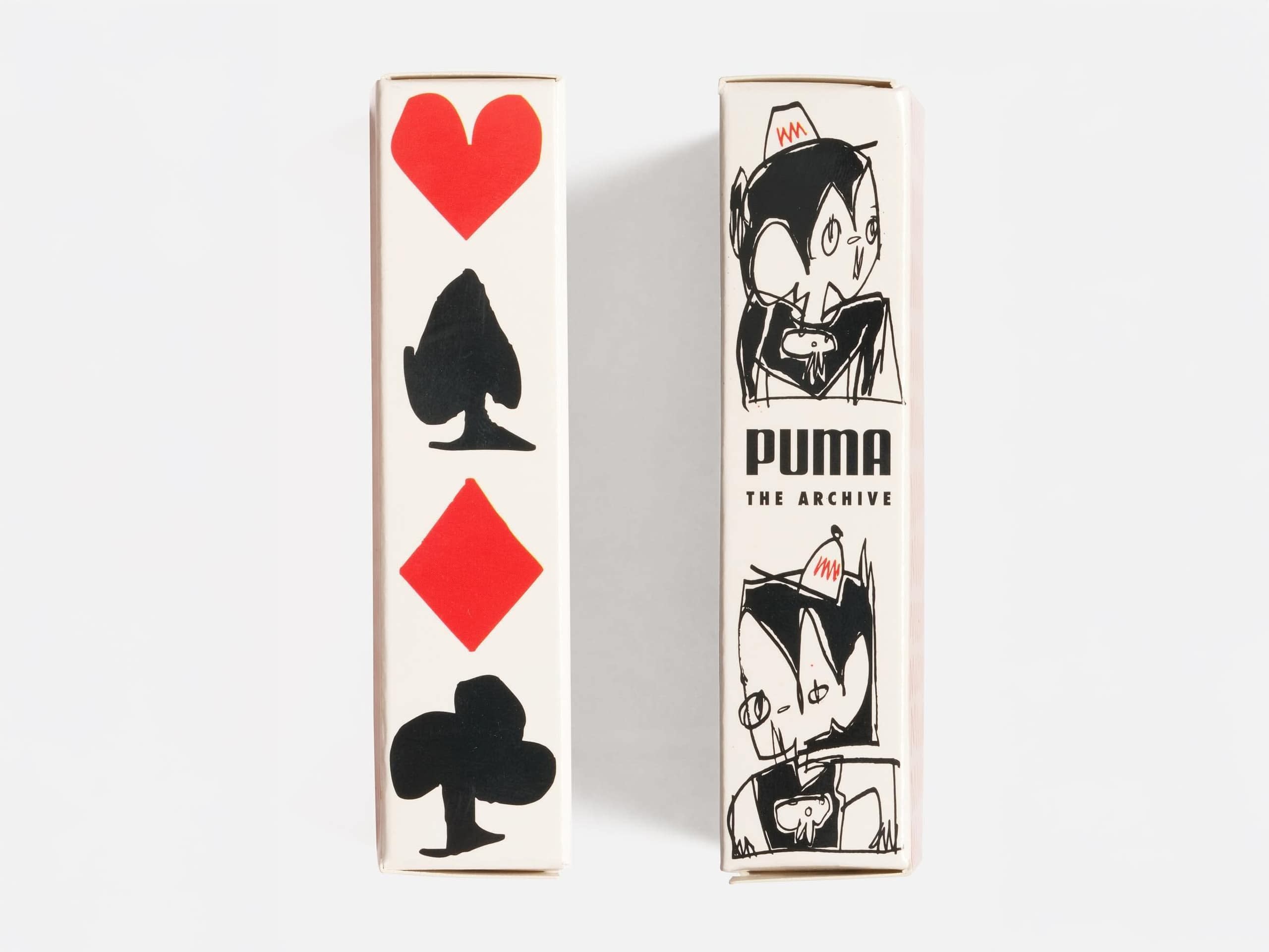
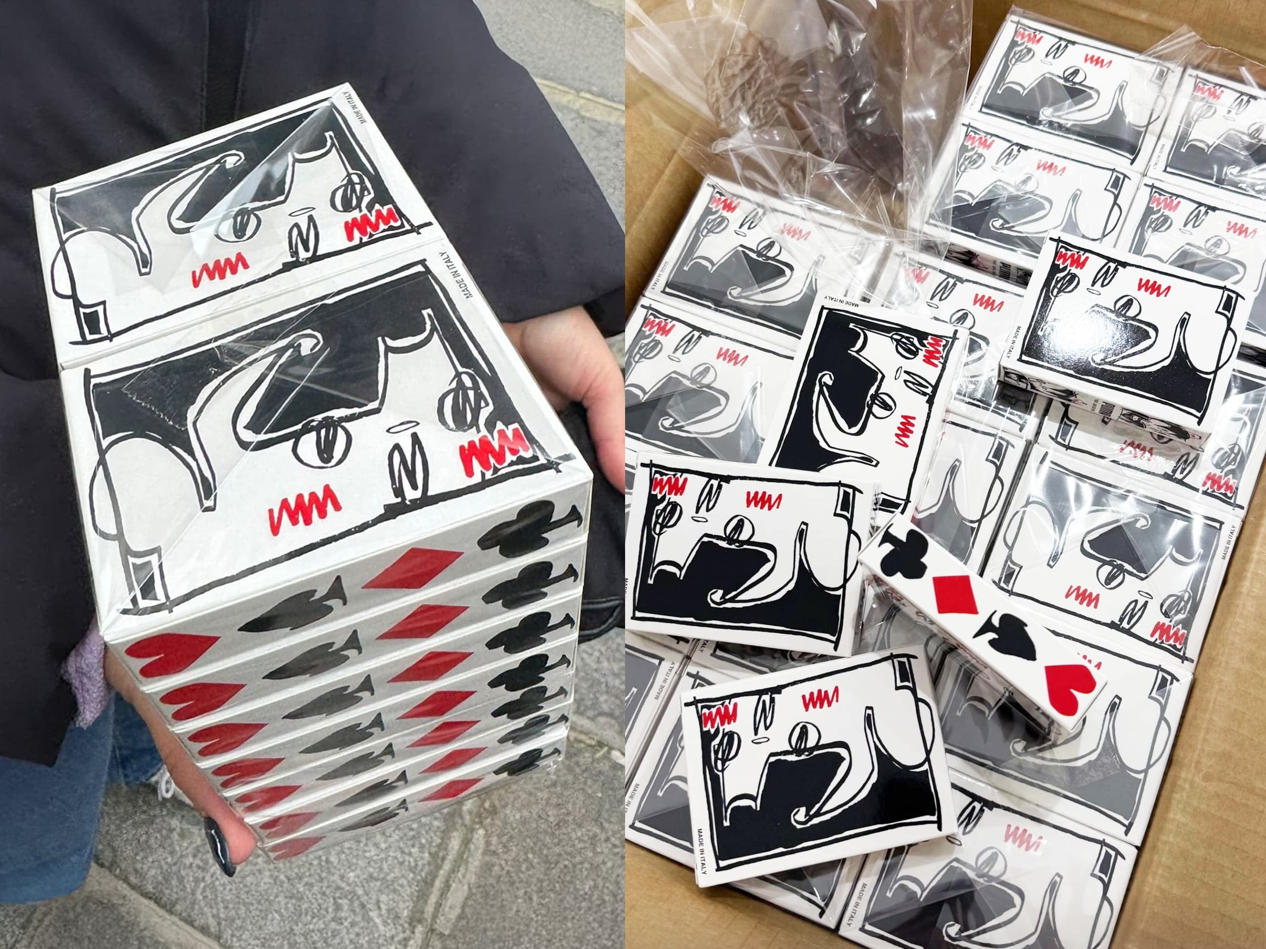
Tasked with showcasing PUMA’s groundbreaking archive with Inside Tag, the goal was to create something lasting beyond a week-long exhibition. Instead of a traditional magazine, I designed a practical, memorable keepsake—a deck of playing cards produced by expert manufacturers Modiano in Trieste, Italy.
Designed in collaboration with Mancunian artist Tomas Gittins, known for his whimsical world-building and “The Joy Must Grow” mantra, the cards celebrate PUMA’s iconic history in footwear design. This unique project brought together the PUMA Archive, Hartcopy, Tomas Gittins, Modiano, and Inside Tag, embodying a shared vision and lasting creative partnership.
- Print Design